Dot.craft
DotCraft, a Limassol-based architecture studio, approached us to craft a brand identity and website that truly reflects their ethos. Inspired by the meaning of "Studere"—a Roman term for disciplined effort—we built a brand rooted in precision, professionalism, and the pursuit of excellence.
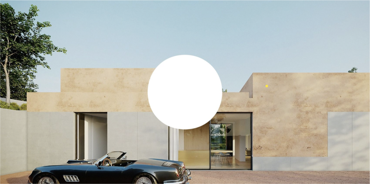
The foundation of DotCraft's identity is the simple yet powerful dot. This dot symbolizes the culmination of effort and the start of new ventures, much like the end of a sentence leading to a new idea. It embodies the studio's commitment to accuracy and the pursuit of perfection in every project.
Visual Identity:
- Colors: Black and white, representing beginnings and endings.
- Typeface: A blend of Roman tradition with a modern twist.
We designed a clean, contemporary brand and website that aligns seamlessly with DotCraft’s values and goals, establishing a strong connection with their audience in the architecture and design space.
.png)
.png)
.png)
.png)
.png)
.png)
.png)